How to build a brand identity for your clothing line
Brand identity is what a customer can predict about you before they open the site. The logo is a small part of that. The bigger parts are the words you use, the photos you post, the price you charge, and the things you refuse to make.
Decide who it is for, in one sentence
Write one sentence: this is for people who want this and are tired of that. If you cannot fill it in without naming three different customers, the brand will read as generic, because it is trying to be for everyone. Factories see this in tech packs all the time, where a luxury trim sits next to a discount fabric because two different customers were imagined in the same document.
Pick a position you can defend
Cheapest, best made, easiest to buy, or most specific. Lead with one and let the others be true but secondary. A brand claiming all four sounds like none of them. If you lead on price, you cannot also lead on fabric. Choose the tradeoff on purpose instead of discovering it at your third price increase.
A quick example. Two brands sell a 120 USD overshirt. One leads on construction and tells you the stitch count, the mill, and why the placket is the expensive part. The other leads on versatility and shows it worn four ways. Both are good. A brand that says it is premium, versatile, and affordable at the same time gives the customer nothing to remember, and the customer buys from whoever gave them a sentence.
Two colours, two typefaces, one rule
A workable system: one dark, one accent, plus white and a neutral. One typeface for headings and one for body, or a single family in two weights. Then a rule about how they get used, something like photos are always natural light and never on a pure white background. Rules are what make a feed look intentional without a designer on payroll.
- Logo: a wordmark beats a symbol for a small brand. It stays readable at thumbnail size on a phone.
- Colour: check your palette at 60 percent opacity on a phone screen before you commit.
- Type: pick something with a real bold weight for product titles, not a thin geometric that disappears at 12px.
- Photography: same background, same light, same crop ratio for every product shot.
The details customers touch
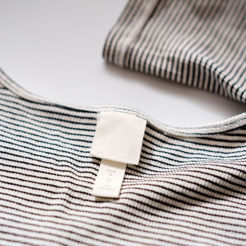
Neck labels, care labels, hangtags, and packaging are where a small brand feels real or feels cheap. Woven labels cost more than printed ones and usually outlast the garment. A 60 USD hoodie with a flimsy printed neck tag reads as a 30 USD hoodie, and no amount of Instagram content fixes that. Spend there before you spend on a box nobody keeps.
Voice is half the identity
Write ten sentences the way you would say them out loud, then cut them in half. Use the same vocabulary on the site, in emails, and on the hangtag. If the site says elevate your wardrobe and the emails say hey, new hoodie, customers notice the seam even if they cannot name what is wrong.
The test for voice is simple. Cover the logo on a product page and read the copy. If it could belong to any other brand in your price range, it is not voice yet, it is filler.
Test it before you commit
Mock up five Instagram posts and one product page with placeholder copy. Show them to ten people in your target group and ask two questions: what does this brand sell, and who is it for. If they guess wrong, the identity is not working, and it cost you an afternoon instead of a full rebrand. Expect two or three rounds. The first version almost always looks like a mood board rather than a brand.
Identity is a set of decisions you keep making the same way. A company with a mediocre logo and total consistency looks stronger than one with a beautiful logo that changes direction every quarter. Consistency is the part you actually control.
Ready to start your brand?
Tell us what you want to make and we'll tell you honestly whether it's worth it.
Contact Us